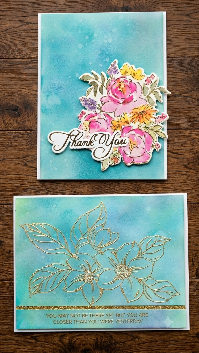
Hello everyone! I’m back today with a project that is all about playing with inks, seeing how they react on paper, and turning a little crafting boo-boo into a feature. If you’ve followed my blog for a while, you know I love mixing and matching supplies from different brands to see how they play together, and this pair of cards is another example of that.

For these designs, I wanted to step away from my go-to white cards and really let the background do the heavy lifting. I pulled out my trusty Hammermill cardstock—which isn’t watercolor paper, but it is super smooth and handles ink blending beautifully—and decided to test out some water splatters.
I blended a mix of Distress Oxide Inks (Stormy Sky, Salvaged Patina, Cracked Pistachio, and Uncharted Mariner) along with a couple of my favorite Simon Says Stamp inks (Blue Violet and Island Blue). To bring the panel to life, I flicked a few water droplets over the ink. Even though it’s regular cardstock, the water reactivated the oxide inks and left these lovely, organic spots that add instant texture without any extra bulk. Also the little warping with heat embossing kinda cleared up the warping from these water droplets.
On the first card, I took that rich blended background and heat-embossed a line-art floral image straight onto it in shiny gold powder. I love how the metallic detail pops against those deep blue and teal tones! My panel was off balanced between the two sides, so the horizontal side would have more white around it compared to the vertical side. To balance the two and leave even border all around, I cut the sentiment area apart and added a simple gold glitter strip through the cut part.
Now, here is a little secret about the second card! I actually tried gold heat embossing another image on this panel too. But the stamped lines were super fine, and my embossing powder wasn’t fine enough, so the embossing turned out totally messed up and blotchy! 🙈
Instead of tossing that gorgeous ink-blended panel in the trash, I decided to cover up the boo-boo! I pulled out a bright, multi-colored floral die-cut cluster and layered it right over the messy embossing, then tucked a scripty “Thank You” die-cut into the bottom curve of the flowers. You would never even know there’s a little crafting mistake hiding underneath those blooms! The flowers are from a washi tape from Pink Fresh Studio, the sentiment from Spellbinders.
I really love how both of these turned out—one feels so sleek and shimmery, while the other became a bright, playful, layered save!
I’m really curious—when a technique doesn’t go quite right in your craft room, do you try to salvage the background with die-cuts, or do you start over from scratch? Let me know in the comments below!
Hugs!
-Varada
Leave a Reply